Friday 3 May 2013

Prezi analysing our trailer with a list of Key Words

<iframe src="http://prezi.com/embed/qy19xlv5z8vb/?bgcolor=ffffff&amp;lock_to_path=0&amp;autoplay=0&amp;autohide_ctrls=0&amp;features=undefined&amp;disabled_features=undefined" width="550" height="400" frameBorder="0"></iframe>


Prezi (Above)

 
We created another summary analysing how effective our trailer was according to key words linking to audience theory. We thought that this would be useful because it enabled us to see how our trailer connects with other trailers that are released in cinemas with a similar genre, and whether it follows these conventions.
The main focus of our Prezi was understanding how our trailer followed the conventions of connotation and denotation, where you see something and visualise something different. This was effective because we could talk briefly about what we were trying to make our audience feel and how they should respond with certain props and costumes.

Wednesday 1 May 2013

Process of creating the poster

We started by analysing trailers and looking into the features that create a poster such as the taglines, the title, main image, colours and the unique selling point.


Once understanding how to analyse each feature we started looking into what horror posters include, how they portray there film to the audience, for example through the use of colours or the main image. We looked into the horror posters that we found inspirational from trailers, so we analysed the Thing and other relevant horrors like Sinister, Possession and The Strangers. We noted down all the common features that they included things like dark/dull colours nothing happy or bright, this is to correspond with either a dark force or the evil killer. If they used happy colours such as yellow the poster would not have the same effect on audience members they would not be intrigued into watching a horror that seems happy. The main image fills the page and this is usually the unique selling point that intrigues the audience because it shows suggestive death or something creepy for example the Possession shows a hand coming out of the girls mouth this makes the audience want to see the film as they can already tell that it is going to be scary and creepy. Other horror posters like Cabin in the Woods, represent a place revealing to the audience that the film will be revolved around this area and bad things will occur.


After looking into horror posters we picked out the main aspects and tried to create an image in our head of what we could have on our poster. I analysed some posters with there trailers to see if i could spot the main image in any part of the trailer or something that linked the two together. For a film to be successful all the advertising products have to link to each other, showing signs of the genre and bits that will appear. If the poster fails to link to the film it therefore does not intrigue the audience as they will be confused after watching the trailer. The poster needs to reveal information about the film to tell the audience something about it otherwise they would have to work it out from the picture. The tagline has to be effective as this reveals the information to the audience if the tagline is not detailed or intriguing then people ignore it and they might not watch the film. During our research we found that many people are intrigued into watching horrors if the poster says it's based on a true story this is because it suddenly becomes more scary as you know it's happened before and it's not just been created.

We waited until we had finished the trailer before creating the poster this is because we screen grabbed some of the footage to create the poster. We looked through the trailer and found parts that we thought would interest audience members and show part of the film, without giving too much away. We screen grabbed too parts and blended them together in the poster, we placed the screen grabs on Microsoft Publisher as this was easier to crop them and change the colour. We placed one screen grab on top of the other and changed the contrast so that they fitted together. During this process we came up with the layout design, we created a tagline there and then by watching the trailer. We went for a more personal tagline then one that referred to our film, we reached to intrigue the audience by saying 'This could be you'. We copied the font for the title and placed it on the poster, along with the names of some of the actors that appeared in it. Next me and Kellie transferred it onto Photoshop so we could save it as a Jpeg, we then uploaded it to our blog. We took the images from the footage we had from the snow shots, this was to create the unique selling point that part of our film occurs in the snow, this is because many horrors happen at dark and dingy places so no one expects to see a horror in the snow.

Process for creating the trailer

Process for creating the trailer THE 13th KILLING
When deciding on what our trailer should be on me and Kellie discussed what genre we wanted it to be, we looked at many different genres such as Romance, Comedy, Horror and Action. Eventually we agreed on doing a Horror trailer as we felt more confident in this area and we understand more on this genre and what aspects should be included in the trailer. We compared horror trailers to see what makes them different and unique, from watching all these trailers we picked up on things that we thought would be effective and achievable. At first we wrote down notes on the characters, setting and any ideas that we had, we then created an Animatic that was based on our notes. Once we had created the Animatic we looked into what we wanted to keep and what could be changed, this helped us decide on the characters and a brief synopsis for the trailer. Kellie looked into make-up ideas that would be appropriate for a horror genre and would look effective.


It ranged from:
Eye Make-up designs Scars on the face maybe from something clawing her
Zombie make-up


  • The next planning idea we created was a mood board on Prezi consisting on different horrors such as Scream and Nightmare On Elm Street. We talked about the plot, the unique selling point, we also talked about the killer and how the Mise-en-scene creates the character. The Prezi goes from old films like the original 1984 version of Nightmare On Elm Street, to almost present time with Smiley released in 2012, from this mood board we could see how horrors have improved over the years and that these killers are well known in the media for the way they look mostly a recognisable face even if they wear a mask. This is because the media's aim in a horror is to intrigue the audience with the killer, by making them look evil, scary and sometimes even there weapon of choice can intrigue the audience to watch the film. We looked into specific aspects such as the Intertitles and what they reveal, they are mainly related to the killer for example an Intertitle in the trailer for Smiley is 'Evil Wears A Smile' this corresponds to the title and what the character looks like as he has a smile that looks like it has been cut with a knife.


  • We created another Prezi with more ideas on it that we discussed after analysing the other horrors, they were only briefly explained as we still weren't sure what we exactly wanted to include in the trailer.


  • After discussing more ideas, we made another attempt at an animatic. In this animatic we incorporated some ideas that we had seen from our research such as our mood board and idea's page, we looked into horrors such as the Thing, the strangers and Smiley. The trailer for Smiley inspired our weapon as they used the knife effectively and it was also an inspiration for our killer as we wanted him to look creepy with unique facial characteristics. The poster for THE THING gave us the idea of a normal setting that is portrayed as something that the audience should fear, the lighting bolt on the poster influenced the way in which our killer will appear on screen. In our animatic we didn't want the killer to be seen straight away which is why we included him near the end, this was to build up tension for the audience and i think when we create the final teaser trailer this will become an effective killer as the audience anticipate there arrival on screen. We also made it so that you can't see the killer's face properly therefore it leaves some enigma's for the audience as they wonder what the killer actually looks like. We analysed our animatic afterwards and found things that we could improve, adding extra techniques and thinking more in depth about the pace of the trailer. We created a prop list which was very simple consisting of three items; a Knife, fake blood and alcohol.

  • We came up with the title for our film in the early stages, this was interesting as we began coming up with ideas as to what we could include, we knew that it had to be different to other horrors and people would wonder who the 13th Killing is and how will they die. We looked into the type of font we wanted and what looked like it belonged in a horror, we were set on using a knife as the weapon since we saw Smiley. We came up with a production schedule to help us plan the trailer, we tried to stick to this as much as possible although some things got completed quicker than other parts.

  • We researched soundtracks that we could use, we had to find non-copy write music, we picked a few from a load and then narrowed it down to 3 which in our final trailer we managed to incorporate all of them as they all fitted with our footage. Me and Kellie looked into possible actors and took photo's, at this point we had decided on a list of character we wanted to include. We analysed costumes for our Killer looking into famous movie killers such as Freddie Kreuger, Scream and so on. These characters are mainly focused on there facial features, which is when we realised that the what they wear is not the eye catching feature, it's the weapon they possess and what there face looks like. Killers like Hannibal Lector wears a white shirt with blood stains on this shows he is the killer, although the audience are intrigued because it represents that he has killed someone they are mainly focused on the mask he wears. We then looked into costumes for our other characters and came up with the idea that they could be dressed as normal teens, they didn't need to have a distinct outfit to make them stand out.

  • We created a film treatment, took some photo's of the location where we hoped to film, looked into making a splatter gun filled with fake blood that the actor could use and fake blood would appear on there clothes. When we first chose to do a horror we automatically wanted to use Twisted Pictures as the institution as we knew they were known for mainly do the horror genre and have produced great films. We created a run through on paper with shot by shot, we wrote down what type of shot and the length the shot will last. Me and Kellie in a lesson made a Storyboard for our trailer, including added scenes and all the information on shot type, the music etc.

  • We made a final Animatic for our trailer which at the time we were set on the idea, however when it got close to filming we had problems with actors making the days and the weather made it difficult to do some of the shots. In the end we filmed at school, using our friends who had time to act in the trailer, at our point of filming it was snowing so we worked with snow and used the fake blood and a knife to create our final trailer. The shots worked well with the snow and we filmed some shots in places where there was no snow, as it was a trailer it didn't have to be all in one place. We used the giant puddle we found to our advantage and had a friend run through it giving the effect of the grey blurry vision. The knife we poured fake blood on it and slit my throat, we darkened the footage to make this more effective, so that it looked like the blood was not fake.
Our planning was inspirational to how some of our shots came out, we still included the idea that you couldn't see the killer's face properly leaving it as an enigma for the audience. We added deaths to the trailer as when we watched our animatic we decided that because it is a horror it needed to have a death, we included a shot where Shelly was crawling away. This was to leave an enigma for the audience, will she survive?

Propps Narrative theory


Propp is known for his theory of narrative, he studied old folk tales where he identified 8 characters that were repeated within every tale. His theory states that every narrative to a film includes these 8 roles.

These 8 character roles are:

1) The Villain (s) - Known as the bad people whose aim is to kill the hero by capturing the female lead (Damsel in Distress)
2) The Hero - Saves the Damsel and normally beats the villain
3) A Damsel in distress - Normally the target for the villains, needs rescuing by the hero
4) False hero - Takes credit for the hero's actions, could go after the Damsel in Distress
5) The Helper - Assists the hero at some point in the plot
6) The Donor - Prepares the hero for the quest, gives them something
7) The Dispatcher - Character who sends the hero on the adventure
8) Victim (s) - the characters who could get kidnapped, or killed depending on the genre

Trailers don't show all these characters as this leaves enigma's for the audience. In our trailer we include more of the victims being killed and running away as it's a horror. We left the killer/villain a mystery for the audience to figure out, we don't reveal any of the helpers that assist the hero because we also decided that we didn't want to give too much away. Propp's theory has allowed us to analyse media personalities through these characters and apply them to films, exploring whether each film uses these characters in similar ways or whether they create their own unique atmosphere to the film.

Sunday 28 April 2013

A2 trailer compared to AS opening two minutes

http://www.youtube.com/watch?v=DfdxL20I4JI


Opening Two Minutes


http://www.youtube.com/embed/1oFGHvd7NMo"


Trailer


These are the two outcomes that I have made over the course of two years, and there is changes that I have made and improved which show similarities but have been made to a better standard and context. Both my opening two minutes and my trailer are horror themed, which means that easy comparisons can be made and how I have broadened my experimentation in filming.
 
The titles that I used for my opening two minutes compared to last year were more relative to the horror genre, the year beforehand I underlined the title which didn't look as effective as if I had left it plain like this year. I had also found that making the title fit the whole screen seemed to be ineffective because it smothered the viewer to look as opposed to a smaller title which was placed directly in the middle like I did this year, this was effective because the audience then focus more easily and it appears more realistic to the horror genre. What I kept the same between the two was the colours that are the same for the horror genre, white titles on black to leave them unemotional and distant. The fonts were also bold and plain which is similar to most other titles in horror posters, opening two minutes and trailers that I have analysed over the two years.
 

The shots were more varied in my opening two minutes but not as effective as this years, the shots were too wide last year so there was no connection with the character. For the trailer, sometimes we didn't want the connection to the characters but it was relevant to the plot. This was unintentional in my opening two minutes, and it didn't have the desired effect I wanted. Working with a number of different actors this year was effective because then the sole focus wasn't on this one character, making it feel more mysterious to the viewer and leaving them further on edge because you couldn't see the surroundings.
I had used the same setting this year as I had last year, this was useful to me because I understood what effects I could create in the area and how I could use them to my advantage. For the trailer this was created in the snow instead, which added literally a cold effect to the environment the characters were within. We used close up shots of the snow to show footprints that made our audience feel as if the killer was on the loose, something I couldn't do in the weather conditions for my opening two minutes. Also compared to last years, this was all filmed in the fields, because the audience couldn't tell the different between some shots in one area to another, the camera didn't pan far enough out to see.
 
Sound has dramatically improved compared to last year. For the opening two minutes I had recorded the wind from outside and put this on a loop throughout the trailer because I didn't understand how to use the sound system. Working with a partner this year was helpful because I was able to get an understanding of the knowledge Jasmine knew and work into music to complete the overall effect of our trailer, using different music for certain paced areas of our trailer. Once I understood how to use it, I dragged the music over each other so you could hear no glitches to when one tune finished and another started. Out of all the improvements I have made compared to last year, this was definitely the most important.
We used a website called http://freeplaymusic.com/ to get non copyrighted music that we could use for our trailer, all of the songs that we though would be most effective we included in a spider diagram used on Mindjet. Out of all of these different music choices we included three for the different paces, saving the music into my documents so that they could be opened on Adobe Premier Elements 10.
 
I included an institution title that I hadn't included at all last year, which made this more effective to be believable to our audience. I had done this by saving the institution video to my documents off YouTube so that it could then be included at the beginning. I didn't understand how to do this last year, but over the A2 project I have learnt how to do this well and therefore my final outcome had been more professional.
 
Overall I think that working with a partner helped me to be able to understand new websites and technology with music and websites, but my knowledge of the area helped me to understand what shots would make this most effective. I have improved massively since last year and it is clearly seen through the elements above.

Wednesday 24 April 2013

Evaluation Activity 3 - Audiance Feedback

http://www.youtube.com/watch?v=EoW4_3Z36W8

 
This was the audiance feedback we recieved for our trailer from the rest of the students in our class, this proved useful because it enabled us to get an insight into what it was that the audiance found most interesting and what could be improved to make our trailer better suited for the genre and create the atmosphere we wanted to create. Our target audiance was of the same age group as the people who analysed (18+), this was beneficial to us because we could get an honest view of what they thought our trailer was like and how it could be improved. They gave positives and negatives which would be taken into account and could be improved further in our trailer, thus making it more interesting to our target audiance.


- These are the feedbacks which we gave for the other groups for thier trailers so we could get an audiance feedback for ourselves. It proved useful because we could get a further understanding of how we could improve our trailer and the elements within it, whilst comparing to other trailers enabled us to see what we could improve and what we should keep the same in order to make our trailer the highest quality.
 
The questions that were asked were answered in our video for our auidnace feedback (top), and are summed up below:
 
1) Have they adhered to the conventions of the genre?
 
This question was asking our audiance whether this trailer adhered to the conventions of a typical horror trailer. Our audiances replied that this does, because of the use of editing and a number of different camera shots which shows a number of deaths from killers and people running around similar to most horror films. This is what we were hoping to achieve in our film, and to see that this has been recognised by our audiance shows that this has been successful.
The point that was recognised most successfully was the way we used the blood on the knife to show that our characters neck had been slit. It was commented that it was very effective at indicating the horror genre and it stays with the audiance until the end. By knowing this we could have shown more of the blood and gore within our trailer to make it more effective to our audiances, using different shots to capture the violence that the audiance want to see more of.
Overall i think the genre had been indicated well to our audiance. We found that the characters set the overall mood of the genre by what our audiance had picked out, running and screaming and gore was the main indications which couldn't be recognised without these elements. This shows how our choice of character and age group completed the overall mood, connecting our chosen audiance age group to our characters. 

 
2) What did you think was effective about camera composition and what could have been improved on?
 
 Our audiance recognised how camera shots had been used to highlight most of the gore and characters within our trailer, which they thought was good because of violence which we were trying to show. I think that to improve these shots we shoulod have taken a number of other shots with a difference, they way the knife was slashed or how it stood out on the camera. I think that this would have improved our trailer because we had to use the same shots multiple times to achieve the fast paced movements we wanted to create.
A comment that was made by our audiances to improve our trailer was the amount of camera shots which could have been used. This was a good indication to spot because i think that we overused the close up shots and other angles may have made our trailer more interesting to watch. This would have been good for shots such as the knife slash. If filmed from a lower angle, this would have appeared more threatening to the audiance as they would be seen as an inferior person to the character who is killing. If there could be improvements, it would be this that we would take into consideration.
 
 
3) What do you think was effective about the editing and use of titles and what could have been improved on?
 
 Our audiance commented that the use of editing was effective because it made it appear dark and mysterious, what we were hoping to achieve. We had the idea of using dull colours such as blacks, greys and whites to show the lack of emotion and darkness in the killings. The fact that our audiance was able to recognise this as the reason how the trailer was atmospheric shows that we used our editing processes on Adobe Premier Elements 10 effectively. It was also commented that these effects worked well because of the amount of different camera shots which cut back and forth from running to killing. This could have been experimented more in terms of organisation and effectiveness but our audiance says that it works well, this must mean that the indiation of seperate scenes wasn't misinterpreted with our clips.
Our titles continued to make our clip more atmopheric to the audiance, using sentences such as 'Your never alone' made them feel on edge and eager to know what happens next. This shows that our development from our storyboards and animatics had payed off in achieveing the atmosphere we wanted to create, and it made appropriate gaps between one piece of action to another.
 
4) What do you think about the narrative structure of the trailer?
 
 The audiance say that they can clearly see that it was a bunch of people on the loose that the killer is trying to get to, which again conforms to the horror genre. Because it is a trailer, we don't understand at this point why they are going after them, this leaves the audiance on edge and wanting to know further what happens in the actual film. But they can also clearly see that they all eventually die, which leaves them questioning why is this happening and what is going to happen at the end of the film?
 
5) Do you think that this trailer was conventional?
 
 The audiance respond that this trailer is conventional because of the choice of institution that we used at the very beginning, twisted pictures, only used in horror films. If an institution such as Universal had been used the indication of horror may not have been fully recognised, which is why our audiance immediatly understand what they are going to be witnessing.
They also recognised that our choice of music helps the pace of our trailer take place, starting slowly then rising upwards only to get slower again. We wanted this in our trailer because we thought that it would leave the audiance tense as to what was going to happen next, slowing down when the dead body is seen once and for all at the end.
The titles such as 'Death' make this conventional as well because that is all you think about in a horror genre, by following this cliche the audiance know that they are going to see the gore they want to see.
 
Overall the trailer has been well recieved with only few changes that need to be made to make this to a higher quality. It fulfilled the conventions of a typical horror genre, but the main consideration if our trailer was to be improved was that the variety of camera shots was minimal. To further improve our trailer, this would need to have been included.

Wednesday 3 April 2013

Evaluation Targets

Well done Kellie - excellent work so far. To be aiming towards a high band three or even band four you need to be much more analytical. Explain what you actaully did in the editing process using some technical terminology. You need to include some audience feedback and also a director's commentary. Revisit your screen grabs and try to analyse the mise-en-scene and your use of camera shots and angles. Explore exactly how your three pieces compliment each other. Well done.

Tuesday 26 March 2013

Fangoria Magazine 2


This Fangoria magazine is similar to how we made ours, it includes the side part of inside information for their magazine.

This part of the magazine is most effective because it seperates our film from being the main focus andb advertising films already popular within the horror genre. It further advertises our film when we made ours because they would be buying it for inside scoop into other popular films. The films we chose were what influenced our trailer, Smiley, Saw and The Thing.

The films included inside the magazine are advertised by small pictures on the front left similar to a movie reel. This is effective because it gives a bigger insight into what the magazine is going to include, and allows horror fans to buy the magazine based on other films they are interested in, advertising the new film that is in big on the front cover.

The costumes and make-up is effective in mnaking the girl look creepy and stand out as a character in a horror genre. By staring at the screen it draws the audiance in closer to see the emotion playing on the characters face, one of this kind makes us feel uneasy and therefore we want to know why, and how they ended up this way.

The titles colour changes on this magazine compared to the last that i advertised, i dont think this is effective because baby blue doesn't relate well to the horror genre and it doesn't grab attention compared to the last that i had looked at. This was an earlier magazine to the one i had analysed before which shows the improvement from then to now.

Evaluation Activity 1 - Screengrabs

1) The Title of the film

 
The title of the film is made using a Minion Pro font, which is effective because the lettering is bold which stands out to the audience and creates a atmospheric effect. I used black on white because it conforms with all the shots that we have already included and blends the title within the background, which adds tension. We chose Minion Pro because it was different from other titles used whilst also being still. We found through our research that the use of flowing titles and lines wasn't effective because it gives the image of emotion which is what is void in our trailer, making this more tense.
The use of a black background is effective because it leaves the audience with nothing else on the screen to attract their attention, forcing them to focus on the title. This is effective because it guarantees that the title will remain with them when watched at the end, whilst also leaving them on edge as to what is going to happen next.
Most horror films have a title which is put on a black background, one example being scream, with their own individual font which is easily recognised when audiences go to watch it in cinemas. Just like our trailer, Scream is also in white font. This is effective because the title is all the audience can look at, we found this was similar in our Prezi when researching horror films as inspiration. By taking this element we created our title, we also used the similar way in which it was placed in the middle, this way it is seen first straight which may not have happened if angled at the bottom of the screen.
This shot is made at the very end of the trailer, which is why this is one of the most important shots. By being the last shot we made it 5 seconds long, this leaves the audience to calm down over the action seen which they then want to know what happens in the film.


2) Setting/Location

We made one of the locations a large field when it was snowing, this was accidental because of the weather conditions which was when we were going to film. However, we considered that snow would make a horror trailer more atmospheric because it shows the image of being cold and out in the open, we considered making camera shots which didn't reveal the true location so that the audience felt on edge. The foot prints which we created in the snow adds atmosphere because it leaves the audience questioning who exactly has been walking in the snow and how does this effect characters which we like. We think this because the characters that we have been made to like run away from the camera straight after we see the snow, which shows us that there has been someone who has been walking on this beforehand. We made the shot darker which contrasts with the white snow so the area appears to be dark and moody, this then leads to us as an audience feeling agitated in the area because it is open and vulnerable, there is nowhere to hide.
By putting our characters in this scene it enabled us to make different shots of kill scenes and running which conforms to the horror genre. By doing this the audience see all the action shots of our characters trying to run from their killer, we included these because it makes the audience feel on edge and it shows a number of different action shots.
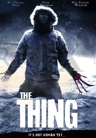
The film we decided to take inspiration from in the end was THE THING, a film which we had looked at through our research repeatedly at times, mainly because it was set in the snow. We found that this was effective because of the way that they used fake blood to mould into the snow, which is what we used eventually in our trailer. In their poster advertisement you can see the way that they use the snow as a way of adding tension to the audience by silhouetting a dark hooded figure. We had used this in our trailer by creating a scene where one of our characters is lying dead in the snow, and the blood was dried in. This was effective because the cold environment leaves the audience on edge and further makes them uncomfortable with the dead body that they see.


3) Costumes


The costumes we used in our trailer were effective because they didn't reveal the true identification of our characters, as seen in this clip. We connected through our research of the use of costumes that teenagers wear day to day, and used similar clothing in darker colours to make it more effective, using editing to further accentuate the killers dominance on the screen. The black clothing that our killer wore for the trailer contrasts against the white snow background making them the dominant person on the screen, this is effective because it goes against the common view that the killer hides in the background away from view, giving our trailer a unique selling point. We don't see any killings in this clip of the killer, only that they are coming close to another character in a menacing way. This connects to the theory of Barthes Enigma Code because it leaves us questioning who the killer looks like, and is this actually the killer? These questions left unanswered make us want to see the trailer in cinemas because it has been jammed to reveal the answer to the end, when a body is found in close up on the screen.
Laura Mulvey's Male Gaze theory consists of the idea that all films are made to be in a Male characters point of view, that women are sexualised on the camera for what male audiences want to see. In our trailer this theory isn't valid because it is all based around the female characters point of view, there is only one male character in our trailer and he hardly connects to the other characters. This is effective in making our trailer unique to this theory because it goes against what audiences expect to see between a male and female character, in a horror however this is only used in a few select films because the audiences expect to see killings rather than love interests. By dressing the killer in male clothing we don't see them in a sexualised way that Laura Mulvey says that women are made to be, whilst the character being killed is also dressed from top to bottom, to keep the continuity that they are within the cold environment.


4) Props

The main prop that we used in our trailer is the knife which we chose the killer to have, this close up shows the main use of it on one of our victims neck. This is an effective choice of prop because we as an audience immediately connect the choice of weapon to a horror film, and we know as a result how this character is going to end up. This choice of prop was used halfway through the trailer to add tension, only we don't see the characters face because the killer hides it. We wanted to create this effect because it enabled us to let the audience think that they could relate to this character because they can place themselves in this characters position. Without the face to distract, it enables the audience to place themselves in this situation, making is more connecting for the audience to watch.
This conforms to the theory of Todorov's 5 stages of narrative, where he believed that all films follow this routine:
  • The starting order of characters within the film - in our trailers case this resolves around all the characters being connected to each other and there are no problems at this point
  • The order starts to be shaken - this is when events start to occur that make the audience start to realise that something is going on but we don't know as of yet. In our trailer we used camera shots to show how all our characters start running, we don't know what they are running from and what is happening. It leaves us questioning what they are running from, and what is going to happen next, however we do know that people are going to be killed because this is what the genre indicates.
  • The order has been broken and a character is honed on to sort out the problem through the rest of the film - We think in our trailer that Shelly is the person to sort this out, however at the end we find that she is eventually murdered, so it is unrevealed who is going to be able to sort out the order that they need to get back to. This is what draws our audience in because they want the identity of this character revealed.
  • Order begins to be resolved, an event takes place where the side we want to win starts to fight back - we see that some of the characters start running in different directions but we don't find out whether any begin to resolve the order, this isn't revealed because it doesn't conform to trailers. If the order is being resolved already to the audience they won't want to see it because the plot has already been given away, which means that stage 5 is also not fulfilled.
  • A new order has been resolved, one that is better from the beginning order - Editing at the end would be in lighter tones and with colour as opposed to black and white, to show that this is the audience that the audience are routing for. We feel connected to this main character as a result and find that this order is preferred to us than before. This is how all horror films would be resolved, including ours, making the connection to our film to this particular theory.


5) Camerawork and Editing

The use of camerawork in our horror film tends to be close ups to show emotions on our victims faces and horror connections which will draw our audience in to watch this in cinemas. We took inspiration from other horror films such as the scene below where the arm of the character is chopped off and blood is strewn across the floor. This is effective because it shows our desires to see blood and gore in cinemas up close. We tried to recreate this in our own trailer by spreading blood along the floor, and the back of her clothing, which we zoom in on in other shots. We found that this was the most received part of our trailer because of the detail that we put in to make this appear creepy, and the fact that the audience think that this is going to be the main character throughout makes us feel connected to this character and her death. We had used editing by making the tones darker, this screen grab started off with being a lighter colour with brighter tones which didn't have the same effect as this, the effects that I have made this way make this mood seem darker and more dull. The snow adds to the creepy atmosphere because it makes us feel uncomfortable for a character to be in a cold environment when murdered.


6) Title font and style

The title font was in Gothic Pro, a bold font with no added flares or flaunts which would make this appear to not be a horror film. We made these titles go against a black background because we thought that this would be effective and it connects to the title of our film. We had used different fonts for this so that the title could be seen as a separate piece of information to these titles, only for the trailer. We placed them directly in the middle because we thought it would stand out effectively against the black background and it encourages the viewer to watch this and nothing else. They were put on separately so that the entire sentence is played throughout the trailer, making the viewer anticipate the next word. Each word is connected to quick shots of our film, for example this shot was placed just before a shot of all the characters running away from the screen, this makes us feel as if we are the ones behind them, making us feel as if we are the killer. This is effective because the knife shot allowed us to feel what it was like to be a victim, while this makes us feel as if we are the killer, giving us two different points of view.


7) Story and how the trailer sets it up


The basic story of this trailer is that a group of girls are out in a public area appearing to have fun at a first glance, only for there to be quick shots of them running and being scared immediately after. This is when the audience start to realise that they are being chased by a mysterious killer and that separate events happen to them to kill them, and it is our job as the audience to find out who the killer is. The characters are seen in different camera shots such as this one, where it shows Shelly crawling away from the camera with blood stains on her back, showing that she has been wounded. This tells us the story because of the choice of make-up which is smeared on her back, only the wounds are not seen. To connect to Barthes Enigma Code, is this her blood or that of somebody else's? It makes us feel uncomfortable because of the way that the camera has been angled upwards so that we are the dominant character, maybe seeing it from the killers point of view? It is also set up that she is going to be killed which would make us feel sympathy for the character but because it is the trailer we don't know her as of yet so there is no emotional connection between the audience and her, therefore making us feel from the killers point of view, we want her to die. This is effective because of the different emotions we were trying to make in different shots, this one being the most important.


8) Genre and how the trailer suggests it

The horror genre is clearly shown in this clip of the knife being slashed on the throat, using red paint to give the illusion of blood being poured out of the gash made. This shot is without any editing effects, before I put in the black and white which made the blood look more realistic. Blood and gore is the main association with horror which is why we made sure that this was seen most of all in our trailer, but we found that the red paint didn't look realistic without the effects. By covering the face we immediately look to the blood and knife in the shot, which is effective because we wanted to make sure this stood out the most. This was followed by quick shots of Jasmine being dragged in the mud so that the blood smeared and showed the violence that we were trying to create. This is similar to our storyline because it begins to be violent in the middle of our trailer, when the killer is finally becoming revealed to the audience.


9) How characters are introduced

The characters are introduced with a 3 second long shot of the characters together in the snow, editing has been used to make the image darker. We made sure that our characters were skipping at the beginning of our trailer because it shows a more light hearted attitude to the trailer before it becomes violent to the audience. This is effective because it gives them the illusion that the trailer is going to be a different genre before the violence began. There is a scream that is heard at the end of this shot near the end which makes us start to realise the genre of our trailer, this is important because there is only one minute in our trailer which we need to include a lot of horror scenes into. Our main character appears to be shelly (purple hoody). We chose this costume for her because she then stands out to our audience as the centre of attention because the other characters are in black, but it isn't until the end that we discover that she is murdered so it is a false identification of our main character. This leaves the audience questioning who the main character is and whether she has already been introduced in this trailer shot, only dressed in black so that we don't realise. The darkening in the special effects is effective because even though it still appears to be a happy scene it gets the audience ready to see the horror that is going to happen next, this will attract more teenagers because they can relate to the character who are of the same age.
 

10) Special effects

We used special effects for another one of our main shots which is Abbie running in the puddle, we used black and white to keep the continuity to other shots in our trailer and appear less emotional to our audiences. These shots don't show any blood and gore which makes us question the relevance of this scene to the others in the trailer. Is there a reason why this is important to our audience?
The special effect we use is called 'ghosting' which allowed the shot to repeat itself in a ghostly like manner so she looked like she was running fast, this was effective because it gives off the creepy vibe which a horror is trying to maintain. You hear her name being shouted in the background which makes the audience wonder who is with her and what scene is happening while she is running away, is it relevant to understanding the killer in our film? What else is heard is the puddle that she runs through over the top of the music to keep the realistic continuity running through, if this was taken out if would have been less believable that she was running through.
We had taken this shot multiple times and used our best three together to add different angles so that we could see her throughout and the surroundings she was in, this is effective because it gives an audience a chance without the close ups to get a bigger understanding of what is happening in her surroundings. It then flows to close up shots of the killer with the knife slashing on the screen. This leaves the audience in suspense, we wonder whether she is the next victim or whether she escaped.


- Genre: The genre for our trailer is a horror, this is shown in our screen grabs with the use of special effects like ghosting and the camera work/ editing. These effects were created in Adobe Premier elements during our editing process, we looked at the different techniques we could find and what would work well to portray our genre. We darkened all the footage to hide the killers face, disconnecting the audience from the characters. Another aspect of our trailer that reveals the genre is the soundtrack, this is because it enhances the atmposhere creating suspence for the audience. We used a variety of camera shots and angles to build on the tension, shots such as the close-up on the knife cutting my throat creates a bigger impact on the audience, compared to if we had shot it from a distance. By having the close-up the audience can clearly see what is happening, and feel involved in what is going on. Other shots like the panning of Abbie runnning through the water is effective because the special effect and the sound of the splashing puddle at to the atmposhere, we made this shot longer to break up the rest of the fast pace action. We wanted the audience to clearly see that there is a danger that the characters are trying to escape from. When Abbie runs through the puddle we chose to show different angles of her running so that the audience didn't just see one continous shot.
- Representation: We represent the horror aspect through the use of props such as the knife and fake blood, we darkened that footage to give the overall effect of the throat cutting. If the footage had been light then the audience would be able to tell it's fake blood and that would take away from the atmposhere and it would lose the effect. We had this shot lasting about 4 seconds to highlight the killing and intrigue the audience.The teenage horror aspect was shown through the characters fear, running away and being dragged back, this clearly shows the teens fear of death. Our horror is also represented through
- Media Language: We chose to only include one word which was a characters name, this is because we wanted to leave the audience wondering what was happening in the other scenes, leaving enigma's. By only having 'Abbie's name called out this tells the audience that this character may have some importance, will she survive?, also it asks the question who was calling her name, it sounded like the person was panicking, was it a friend asking her to wait or help her? We used minimal dialogue as we wanted the music and effects to advertise our film, rather than having the dialogue reveal what is happening. By not having dialogue it intrigues the audience and leaves enigma's for them to find out.
- Audience: The target audience for our trailer was Teenagers, we addressed this through the use of our actors being teens therefore the audience can relate to them through their emotions, it takes the audience on a life journey. We aimed for the teenage audience because we wanted to create a horror that was not gory, but created suspence. We have done a questionnaire to see our audience feedback, which shows that we made the right choice for our target audience as they were intrigued by all three elements; the trailer, poster and magazine front cover.

Mise-En-Scene: We decided on having everyone dressed in normal clothes, this is because we didn't want the audience to figure out who the killer was by them having a distinct outfit. The clothing was that of typical teenagers according to the weather conditions. We had them wearing different outfits as it was a trailer and it shows that the action was happening on different days, meaning that the killer attacked them separately.
 

Fangoria Magazine


Fangoria magazine appeals to audiences interested in the horror genre which is what we have used for our magazine. This magazine cover is effective because it contains other captions that conform to more popular magazines such as Empire, but is only associated with horror films.
The use of title on the magazine is effective because it stands out to audiences and can be easily seen when sold in shops. The title is bold and takes up the top of the screen which is what we have done in our magazine, this conforms to typical magazine covers.

The titles included advertise other films which is what we conformed to in our magazine cover, it is to show that the films advertised are inside the magazine along with our own. This is effective because the image for this film attracts them to buy and therefore look at other films.

Fangoria is advertised in bold font and takes up the top part of the magazine. The font is used for all their magazines so it can be easily distinguished to other magazines when sold. This is effective because it enables horror fans who already know this magazine to easily recognise this film on the shelves. The title in red could symbolise the blood and gore of horror along with the points at the end of the letters 'f and a' being symbolism for sharp teeth that coincides with the image below.

The first thing that you see when you see when you look at this magazine is the teeth and blood because it is centred in the middle of the magazine and attracts the audience that it is intended for because of the blood and gore. This is effective because it is the unique selling point of this magazine and the films that are advertised.

Using Fangoria in our magazine shows that this will be the a horror genre to the audience, attracting we people that we want to go watch it in cinemas. By advertising this a month earlier  than our trailer, it leaves the audience anticipatiing our film that is to come.

Monday 25 March 2013

Evaluation Activity 2 - Directors Commentary

<iframe width="420" height="315" src="http://www.youtube.com/embed/XAK70DT10Ag" frameborder="0" allowfullscreen></iframe>

We created a directors commentary over our video footage to explain certain aspects of our film, poster and magazine cover and how they connect to each other to promote the film. (Link Above).

We again used adobe premier elements because it was the easiest to use for editing, we simply deleted the music underneath and split audio and video to delete the volume from some of the clips.
We had done this to create authenticity since this is done for trailers and films that are released into cinemas, it allows the audiance to get an insight into what we were trying to create, what emotions we were trying to carry forwards due to effects.


In our directors commentary, we see that the magazine front cover and the poster compliment the trailer in advertising by:
  • The titles - We had used the same fonts in the magazine and poster as we did in our trailer, showing the connection between them. This is effective as the audiance will instantly recognise the title and it keeps the continuity of the horror genre by the lack of detail, as it is just black and bold. Through our research we found out that this is the style of title commonly used in horror films. The same titles were effective in advertising because the audiance instantly recognise it and know that they are connected. We had talked about this in our directors commentary, explaining the effect that this title creates to the audiance and how the boldness shows the genre of the title.
  • The use of characters - The characters are made to appear as part of the horror genre by the use of editing which is in our trailer and magazine and poster to black out their faces and emotions. This leaves the audience questioning who the characters are and what their relevance is to the trailer, and it also leaves an enigma to the audiance as to what is going to happen next in the trailer. This trailer was for an audiance of teenagers which we considered in our directors commentary by using teeenagers as our actors. This is effective because it attracts the right age group to our trailer which they will then want to watch in cinema, therefore creating a profit to our film when it is released. We had shown teenagers in our poster and magazine cover, this made our trailer link clearly for audiances to clearly recognise. This is useful for attracting audiances further as they would all be promoting the film.
We discussed other elements in our directors commentary which gives a brief insight into what we were trying to create to make our trailer effective. In more detail, we were explaining these elements:
 
  • The choice of genre - Horror was a genre that audiances were appealed to more than others besides action, and our personal choice was horror as we had a greater understanding of the conformities and cliches. This genre allowed us to use editing a lot on Adobe Premier elements to achieve the atmospheric vibe that our trailer has along with the choice of music, which would peak at the correct moments to leave the audiance on edge. Apart from personal preference, we decided to choose horror because there seemed to have a greater mass of people in cinemas than action films, in our questionnaire we discovered that the most popularised films were combined with less popularised with audiances, giving us an edge to this genre as a film that could be successful in cinemas when released. The advantages of choosing this genre is that our understanding of horror enabled us to create cliches and use the appropriate editing techniques to achieve the tension which makes audiances interested in going to see it in cinemas. Another positive is it was also easy to film, most of the clips were close up which enabled us to film it in any area, however the snow scenes were coincidental due to the weather of our surroundings. The improvements we could make were the amount of shots we could have filmed, the number of quick shots we had were minimal and more would have made it more interesting to the viewer.
  • Camera Angles and Shots - We talked about one camera angle and shot scene specifically which involved Abbie running through the puddle in black and white. It was made more atmospheric with ghosting and a monochrome colour, this made Abbie appear as if she were running fast in the scene and the darkness of the shots conformed to the horror genre. These were on the Adobe Premier elements software we used which we created by dragging the effects onto the clip, there were automatically edited for us. This was why we decided to choose this software because it was easier to use and allowed us to cut the clips for the different shots. We had used three different shots of abbie running through the puddle and one of those shots also included panning, this was effective as the audiance could feel involved in this particular scene and be able to follow the direction she was running in. We firstly see her running towards the camera, which is then cut immediatly to her running with her facing the side. The positive about this was how we made the feet fall at the perfect time so the continuity wasnt ruined, and it makes us as an audiance feel as if she hasn't stopped running as the camera has changed. This process is the same for the last shot. The improvements that could have been made for this shot is the amount of time she was on the screen. Horror trailers are usually quick paced and the shots are only a few seconds long, this however lasts for longer than the rest of our trailer.By cutting this down it would be more believable as a horror film trailer.
  • Enigmas - We wanted the trailer to not reveal anything about the killer. We were influenced by Barthes Enigma Code  which was about how all films don't reveal some of the information to the audiance to make them intrigued as they want to know what happens. This is relevant to our trailer because we didnt want to reveal the true identity of our killer. We analysed this because it is what the audiance want to know the most otherwise the violent acts are less effective and if too much information is revealed it doesnt have the same impact as they know what is happening. We darkened the faces of our characters when violent acts occured, this way the audiance were always left on edge and questioning who this person is.
Overall our trailer follows the cliches of typical horror films and the elements above prove this.


Thursday 21 March 2013

MAGAZINE COVER - THE 13th KILLING


We have created a magazine front cover using Microsoft Publisher because we could move different titles and images around to where we wanted them to be. This was effective for our work because it enabled us to move around the titles so we could decide which was the best place to have them without considerations of rewriting or font style, as this could also be easily changed in the text box.
We used the Fangoria magazine as an inspiration for our front cover as it is associated with the horror genre. We included captions that would attract our target audience and clearly advertised the title of our trailer along with other horror films that we had previously looked into as inspiration.

When we were deciding what to include in our magazine we looked at different Fangoria magazine front covers and found that they advertised other elements within the magazine such as DVD reviews and free posters. We found that this was effective in intriguing the target audiance as it makes it more appealing for them to know more about the magazine. By including Fangoria on our trailer we have immediatly shown that our trailer is a horror because this genre is all the magazine advertises,

By adding the caption in bold red font 'potentially the most disturbing film since Texas Chainsaw Massacre', it reveals to the audience that this film is equally as terrifying and attracts fans who have seen that particular film.

We decided to include a caption about the film having a brand new director because the age group of the audiances are older, and from our research we have found that certain directors produce better films in specific genres. By mentioning the directors name it could potentially promote sales for future films.

- During our research on magazine front covers we looked at the layout design, what advertising features they use and whether we thought it was effective for the horror genre.
Example:
We researched many different magazine front covers such as Fangoria, Empire magazine and Total film. We chose to use Fangoria magazine as an inspiration for our magazine front cover as it is associated with advertising the horror genre. We included captions that would attract our target audience and clearly advertise the title of our trailer along with other horror films that we have previously looked into as inspiration.
When deciding what to include we looked into different Fangoria Magazine covers and found that they advertised elements within the magazine, such as DVD reviews and free posters. We found that this was effective in intriguing the target audience as it makes it more appealing for them to know more about the magazine. By giving people information about the contents within the magazine, they know what they are getting for there money, whereas if it just states one section of the magazine to do with the film, the audience might not think it's worth buying if they don't know what else is in it. During our research it was clear to us that the more information there is on a magazine front cover the better, however we realised that too much information can have a negative impact as it distracts the audience from the main aspect of the magazine which is advertising the film.
By adding the caption in bold red font 'Potentially the most disturbing film since Texas Chainsaw Massacre', it reveals to the audience that this film is as equally terrifying and attracts fans who have seen that particular film. We wanted to give the audience something to compare the film to before they even watch it so that they are already intigued and want to know why is more disturbing then Texas Chainsaw Massacre, what awful events are going to take place. It was an opportunity for us to add more depth into the film and get people talking about it, making it more widely spread and popular.
We decided to include many different elements such as giving people a free poster, revealing other information within the magazine. We were inspired to include the section on the left hand side because we wanted it to link with previous research that we had done with the trailer. This is why we included a little information about three other horrors that we had seen trailers for they were; Smiley, which inspired our weapon choice for the film. Saw, this inspired us to not show the killer's face as we wanted it to be a mystery. The Thing we analysed the poster which gave us some ideas for our poster in the way we wanted some enigma's for the audience to find out.

Wednesday 20 March 2013

TRAILER - THE 13th KILLING

<iframe width="560" height="315" src="http://www.youtube.com/embed/1oFGHvd7NMo" frameborder="0" allowfullscreen></iframe>


Trailer

This is our Trailer for our A2 project, we chose the horror genre as we felt more comfortable with this chosen area. I watch a lot of horror films and the trailer for me is always the advertising feature that intrigues me. We included many genre indicators such as the use of props, the close-up angle shot of me having my throat cut immediately reveals the genre to the audience. The type of shot adds to the impact of the action and builds on the atmposhere created by the pace of shots and the music. When working with Adobe Premier Elements me and Kellie looked into what we already knew about the software so what we used in our AS projects. We then found other features that we thought would work well in a horror and tried to incorporate them into our trailer. Special effects became a part of our trailer in many ways, we darkened the light contrast on the footage to create more suspence and disconnect the audience from the actors, the 'ghosting' effect which i found effective because we used three different shots and placed them together, the effect added to the overall atmposhere making her look like she was runnning faster than what she was. We used continuity in these shots as we placed them together making sure that it looked professional for audience members.
We varied the length of the shots ranging from a slow pace at the beginning to build up the atmposhere and get the audience engaged with the trailer from the start. We then quickened the pace and made some of the shots about 2 seconds long, this was so that the audience could just about see enough of the action to know what was happenening, we felt by quickening the footage this was more relevant for the horror genre as people expect to see fast shots that reveal parts of the film. A horror trailer is best suited to fast paced shots and music, if it was slow throughout people would not be intrigued as it might say that the whole film is slow and nothing atmposheric happens. These are cliche'd conventions and we played on what the audience expect, however we also left enigma's by not revealing the killer in too much context, this was so that the audience would see something different to other horror trailers. The shots we used were to stop the audience from clearly seeing the surrounding, they were aware that it was shot outside meaning that the characters had little places to hide from the killer, this was intruing the audience into wondering where they were going to hide and how they escape if they do?
By not having many words, we left the audience with the pace of the trailer and the music, we found this effective as many horrors use these functions to build on tension and create atmosphere for the audience. However they also include more words this is where we wanted to be unique and different and went for a purely special effect and music approach. We found this more effective as it gave less away about the characters and the narrative, however the shots were effective enough to reveal some of the narrative to the audience, without making them clueless on what was going on.
Our horror trailer was suitable for our target audience as we didn't include any gore, we showed some killings and the music created the tension and atmposhere we wanted. The audience were left intrigued and wanting to know more, they said that the music corresponded with the horror genre and the shots fitted the music making it even more effective. We used teenage actors so that the audience could relate to them through there age, it made them feel more connected to the trailer and the characters.

Throughout all our research this is the final outcome that we have come to. Our trailer has had some changes to the original Animatic due to the weather that we had been in but the storyline is still the same.
Throughout our research we have found that this was most successful because of editing and camera shots, in our evaluation activities we will be analysing how our trailer effected the audience towards wanting to see our film.
Through our research we had found that titles to the genre had been bold and unemotional in their appearance, which is why we chose Minion Pro. This was effective because it can clearly be identified compared to other elements in our trailer.

Our trailer consisted of 5 main actors:
  • Abbie - potential killer
  • Matt Beacham - Killer
  • Jasmine bridger - first victim (knife slash scene)
  • Michelle Clement - Last victim (snow ground scene)
These actors were effective because it is a more female based grouping, with only the male as the main killer. This is effective because it allows men to be more attracted to our trailer according to the Male Gaze by Laura Mulvey. In this theory it is described that men want to see the woman in distress so that the male or the 'hero' of the film can save the damsel from death. The only problem with this is that the male character is the killer, and there is no other male character seen within our trailer. this makes us wonder whether there is a man to save or whether it is going to be the women that save the day, going against Laura Mulveys theory.


Animatic

 
This is our animatic for what our trailer was supposed to look like in A2, and certain elements are similar but things had to be changed because of the snowy conditions we ended up eventually filming in. One of the examples is the puddle scene at the beginning, the puddles had been frozen and covered in snow so this couldn't have happened. Usually this would have been a problem for filming but we decided to take inspiration from the film we researched THE THING, and film our trailer in the snow. This was effective because it stood out as a unique selling point, not many trailer do this. But also because of the different shots we created after the snow was gone, we made sure to do this because then it appears we are showing different parts of the trailer at different time periods.

To find out how our trailer has been received, we have decided to do 4 evaluation activities which will help us understand what went well and what can be improved to make our trailer better. The evaluation activities will consist of and audience feedback, where we will get them to sit down and talk about what was successful and what can be improved. A directors commentary, where we will discuss how we made certain elements effective and what can be improved, the choice of equipment we used and how it was essential to making our trailer of a higher quality to last years work, and finally a look at different screen grabs and connections to different theorists. These theorists will help us understand how our trailer interlinks to most other trailers in show today.

Monday 11 March 2013

Evaluation Activity 4 - Equipment we used

We have used Blogger as a diary for all of our media coursework, it has details of the lead up to our trailer consisting of props, costumes, make-up and ideas. We have used this to help us keep track with the our trailer production and have been looking into poster designs alongside analysis of trailers. Blogger has been the center of our film information, allowing us to look in more detail at certain aspects. Blogger has been the easiest option to keep all our work on, it allows you to upload images, videos and screen grabs, you can add links to your work such as Prezi and powerpoints which gives you more techniques that you can use when blogging. It is a fast process which you can keep updating as you go along, if you want to add more information you can, it does not finalise your post.


We have used Youtube to upload our animatics, storyboard and our trailer along with a director's commentary. Youtube allows us to upload it to our blog, as you can't do it straight from Premier Elements. We used Youtube as it is a trusted and global website where you can easily upload footage and people can comment on the work you have done. It allows us to get some feedback from audience members and we can track how many views it has got. To upload the video from Youtube to our blog we embeded the link and added it to our blog.
 
 
We have used Premier Elements again this year for our media production, we know how to use the site and have managed to get more interesting elements from it this time around. We discovered new effects that we could use such as 'ghosting', these different elements have made improvements to our trailer. The first step to creating our trailer was to set up a new project and upload our footage, to do this;
Adobe Premier Elements 10 - setting up a new project.
Step by step instructions:
Step 1 - Change settings
Step 2 - Double click Pal
Step 3 - Double click HDV
Step 4 - Double click HDV720P25
Step 5 - Clcik OK
Save as Adobeflashvideo
presets-5th one down ~ FLVweblargepalsource (8 and higher)
-SAVE
The next step is uploading the footage to do this you click get media, click files and folders and select all the videos you want to use, it then uploads it to the site. When all the videos appear on screen, the will play if you double click them.
To begin creating the trailer we looked at all our footage and decided to play around with the order, so we dragged the videos into the boxes on the sceneline at the bottom. Once we had decided that the order was ok, we placed in the music and this helped us to fit the scenes around the pace of the music. We found some of the footage worked best with certain parts of the music and other sections didn't fit. To add music you do the same action as you would to get the footage except you click on your music that you have inyour files and folders. It then comes up in the same section as your footage, you can then drag it below your footage and it should play along with the videos.
We used the timeline part rather than sceneline after we added the music, this is because we found it easier to organise the footage and we could see how long our trailer was as it was progressing. Once we had all the music and videos together, we worked on the pace of our shots, we cut some of the clips down by moving the cursor over the clip you want to cut down and it will automatically allow you to crop the clip with a click of the mouse. You simply drag it to the exact time you want it to be.
We looked into special effects, we clicked edit on the screen and it shows you all the video effects that are available. We played around with a few to see what they looked like and whether we thought they would be effective. When on the editing part you we added our tintertitles, using the title section, this allowed you to write over a blank screen. Due to us filming in the snow some of our footage was bright from the white snow, so we looked at all the footage and decided to make it darker, to make the clips darker you choose the clip you want and there is a yellow line across it that you can drag higher or lower to change the contrast. The last thing we did after doing all the music,videos and editing was to add the twisted pictures at the begnining, we did this by downloading the clip from youtube onto a memory stick and then uploaded it to Premier Elements. During the process it did not crash and our trailer came out well, we had no problems with the footage or editing.


We used the school tripod to keep our filming steady and accurate, although some of the shots we wanted to look like it was someone holding the camera so it was alright for them to not look professional. The tripod was easy to handle although when filming in the snow it was harder to get it sturdy, causing us some problems as it took more time to set up, however it was simple to use as it held the camera in place and gave us the shots we wanted. The tripod allowed us to create a variety of shots, as we could make it lower to the ground or make it higher, we used it to pan so that it was flowing and not shaking. If we hadn't used a tripod our shots would have been less professional and it would have shown in our trailer, the effect of the trailer would be different as some of the shots wouldn't of looked right. The tripod gives you the chance to create perfect shots that you want and you are not worried about it moving.


We used Kellie's camera to film as we knew it had a clear image and we could use it accurately, it was light and easy to handle. It fitted onto the tripod and we were able to film many shots, we didn't have to worry about any shots not coming out right. With the camera we were able to zoom in or zoom out creating different angles and shots to establish certain aspects of the trailer. The camera was fine when filming and when uploading the shots onto the computer it was fast and there were no problems with the footage being too high in resolution. We used it for the basic filming of the shots, everything else was down to how we edited it on the computer for special effects.