Wednesday, 20 March 2013

TRAILER - THE 13th KILLING

<iframe width="560" height="315" src="http://www.youtube.com/embed/1oFGHvd7NMo" frameborder="0" allowfullscreen></iframe>


Trailer

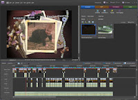
This is our Trailer for our A2 project, we chose the horror genre as we felt more comfortable with this chosen area. I watch a lot of horror films and the trailer for me is always the advertising feature that intrigues me. We included many genre indicators such as the use of props, the close-up angle shot of me having my throat cut immediately reveals the genre to the audience. The type of shot adds to the impact of the action and builds on the atmposhere created by the pace of shots and the music. When working with Adobe Premier Elements me and Kellie looked into what we already knew about the software so what we used in our AS projects. We then found other features that we thought would work well in a horror and tried to incorporate them into our trailer. Special effects became a part of our trailer in many ways, we darkened the light contrast on the footage to create more suspence and disconnect the audience from the actors, the 'ghosting' effect which i found effective because we used three different shots and placed them together, the effect added to the overall atmposhere making her look like she was runnning faster than what she was. We used continuity in these shots as we placed them together making sure that it looked professional for audience members.
We varied the length of the shots ranging from a slow pace at the beginning to build up the atmposhere and get the audience engaged with the trailer from the start. We then quickened the pace and made some of the shots about 2 seconds long, this was so that the audience could just about see enough of the action to know what was happenening, we felt by quickening the footage this was more relevant for the horror genre as people expect to see fast shots that reveal parts of the film. A horror trailer is best suited to fast paced shots and music, if it was slow throughout people would not be intrigued as it might say that the whole film is slow and nothing atmposheric happens. These are cliche'd conventions and we played on what the audience expect, however we also left enigma's by not revealing the killer in too much context, this was so that the audience would see something different to other horror trailers. The shots we used were to stop the audience from clearly seeing the surrounding, they were aware that it was shot outside meaning that the characters had little places to hide from the killer, this was intruing the audience into wondering where they were going to hide and how they escape if they do?
By not having many words, we left the audience with the pace of the trailer and the music, we found this effective as many horrors use these functions to build on tension and create atmosphere for the audience. However they also include more words this is where we wanted to be unique and different and went for a purely special effect and music approach. We found this more effective as it gave less away about the characters and the narrative, however the shots were effective enough to reveal some of the narrative to the audience, without making them clueless on what was going on.
Our horror trailer was suitable for our target audience as we didn't include any gore, we showed some killings and the music created the tension and atmposhere we wanted. The audience were left intrigued and wanting to know more, they said that the music corresponded with the horror genre and the shots fitted the music making it even more effective. We used teenage actors so that the audience could relate to them through there age, it made them feel more connected to the trailer and the characters.

Throughout all our research this is the final outcome that we have come to. Our trailer has had some changes to the original Animatic due to the weather that we had been in but the storyline is still the same.
Throughout our research we have found that this was most successful because of editing and camera shots, in our evaluation activities we will be analysing how our trailer effected the audience towards wanting to see our film.
Through our research we had found that titles to the genre had been bold and unemotional in their appearance, which is why we chose Minion Pro. This was effective because it can clearly be identified compared to other elements in our trailer.

Our trailer consisted of 5 main actors:
  • Abbie - potential killer
  • Matt Beacham - Killer
  • Jasmine bridger - first victim (knife slash scene)
  • Michelle Clement - Last victim (snow ground scene)
These actors were effective because it is a more female based grouping, with only the male as the main killer. This is effective because it allows men to be more attracted to our trailer according to the Male Gaze by Laura Mulvey. In this theory it is described that men want to see the woman in distress so that the male or the 'hero' of the film can save the damsel from death. The only problem with this is that the male character is the killer, and there is no other male character seen within our trailer. this makes us wonder whether there is a man to save or whether it is going to be the women that save the day, going against Laura Mulveys theory.


Animatic

 
This is our animatic for what our trailer was supposed to look like in A2, and certain elements are similar but things had to be changed because of the snowy conditions we ended up eventually filming in. One of the examples is the puddle scene at the beginning, the puddles had been frozen and covered in snow so this couldn't have happened. Usually this would have been a problem for filming but we decided to take inspiration from the film we researched THE THING, and film our trailer in the snow. This was effective because it stood out as a unique selling point, not many trailer do this. But also because of the different shots we created after the snow was gone, we made sure to do this because then it appears we are showing different parts of the trailer at different time periods.

To find out how our trailer has been received, we have decided to do 4 evaluation activities which will help us understand what went well and what can be improved to make our trailer better. The evaluation activities will consist of and audience feedback, where we will get them to sit down and talk about what was successful and what can be improved. A directors commentary, where we will discuss how we made certain elements effective and what can be improved, the choice of equipment we used and how it was essential to making our trailer of a higher quality to last years work, and finally a look at different screen grabs and connections to different theorists. These theorists will help us understand how our trailer interlinks to most other trailers in show today.

Monday, 11 March 2013

Evaluation Activity 4 - Equipment we used

We have used Blogger as a diary for all of our media coursework, it has details of the lead up to our trailer consisting of props, costumes, make-up and ideas. We have used this to help us keep track with the our trailer production and have been looking into poster designs alongside analysis of trailers. Blogger has been the center of our film information, allowing us to look in more detail at certain aspects. Blogger has been the easiest option to keep all our work on, it allows you to upload images, videos and screen grabs, you can add links to your work such as Prezi and powerpoints which gives you more techniques that you can use when blogging. It is a fast process which you can keep updating as you go along, if you want to add more information you can, it does not finalise your post.


We have used Youtube to upload our animatics, storyboard and our trailer along with a director's commentary. Youtube allows us to upload it to our blog, as you can't do it straight from Premier Elements. We used Youtube as it is a trusted and global website where you can easily upload footage and people can comment on the work you have done. It allows us to get some feedback from audience members and we can track how many views it has got. To upload the video from Youtube to our blog we embeded the link and added it to our blog.
 
 
We have used Premier Elements again this year for our media production, we know how to use the site and have managed to get more interesting elements from it this time around. We discovered new effects that we could use such as 'ghosting', these different elements have made improvements to our trailer. The first step to creating our trailer was to set up a new project and upload our footage, to do this;
Adobe Premier Elements 10 - setting up a new project.
Step by step instructions:
Step 1 - Change settings
Step 2 - Double click Pal
Step 3 - Double click HDV
Step 4 - Double click HDV720P25
Step 5 - Clcik OK
Save as Adobeflashvideo
presets-5th one down ~ FLVweblargepalsource (8 and higher)
-SAVE
The next step is uploading the footage to do this you click get media, click files and folders and select all the videos you want to use, it then uploads it to the site. When all the videos appear on screen, the will play if you double click them.
To begin creating the trailer we looked at all our footage and decided to play around with the order, so we dragged the videos into the boxes on the sceneline at the bottom. Once we had decided that the order was ok, we placed in the music and this helped us to fit the scenes around the pace of the music. We found some of the footage worked best with certain parts of the music and other sections didn't fit. To add music you do the same action as you would to get the footage except you click on your music that you have inyour files and folders. It then comes up in the same section as your footage, you can then drag it below your footage and it should play along with the videos.
We used the timeline part rather than sceneline after we added the music, this is because we found it easier to organise the footage and we could see how long our trailer was as it was progressing. Once we had all the music and videos together, we worked on the pace of our shots, we cut some of the clips down by moving the cursor over the clip you want to cut down and it will automatically allow you to crop the clip with a click of the mouse. You simply drag it to the exact time you want it to be.
We looked into special effects, we clicked edit on the screen and it shows you all the video effects that are available. We played around with a few to see what they looked like and whether we thought they would be effective. When on the editing part you we added our tintertitles, using the title section, this allowed you to write over a blank screen. Due to us filming in the snow some of our footage was bright from the white snow, so we looked at all the footage and decided to make it darker, to make the clips darker you choose the clip you want and there is a yellow line across it that you can drag higher or lower to change the contrast. The last thing we did after doing all the music,videos and editing was to add the twisted pictures at the begnining, we did this by downloading the clip from youtube onto a memory stick and then uploaded it to Premier Elements. During the process it did not crash and our trailer came out well, we had no problems with the footage or editing.


We used the school tripod to keep our filming steady and accurate, although some of the shots we wanted to look like it was someone holding the camera so it was alright for them to not look professional. The tripod was easy to handle although when filming in the snow it was harder to get it sturdy, causing us some problems as it took more time to set up, however it was simple to use as it held the camera in place and gave us the shots we wanted. The tripod allowed us to create a variety of shots, as we could make it lower to the ground or make it higher, we used it to pan so that it was flowing and not shaking. If we hadn't used a tripod our shots would have been less professional and it would have shown in our trailer, the effect of the trailer would be different as some of the shots wouldn't of looked right. The tripod gives you the chance to create perfect shots that you want and you are not worried about it moving.


We used Kellie's camera to film as we knew it had a clear image and we could use it accurately, it was light and easy to handle. It fitted onto the tripod and we were able to film many shots, we didn't have to worry about any shots not coming out right. With the camera we were able to zoom in or zoom out creating different angles and shots to establish certain aspects of the trailer. The camera was fine when filming and when uploading the shots onto the computer it was fast and there were no problems with the footage being too high in resolution. We used it for the basic filming of the shots, everything else was down to how we edited it on the computer for special effects.

Coursework Targets

Fantastic top band research and planning Kellie - providing we analyse a few more magazine front covers and explain how they will influence your decisions. Show evidence of how you planned your poster - why have you chosen the layout, pictures and fonts and why do you think this would work with your target audience?You also need to have analysed the effect of your ideas in your storyboard - why have you made the decisions you have done in your animatic? This Wednesday - film uploaded. Last Friday of term - Film poster and front cover of a magazine uploaded. First day back - Evaluation activities complete. You have a lot of work to do and no time to waste!

TEASER POSTER - THE 13th KILLING


We made the poster for our trailer using Adobe Photoshop, we print screened shots from our trailer to create the poster. We also manipulated the size of the images to show different aspects of the trailer. We used black and white throughout the poster to show the theme of our trailer, the white of the snow represents innocence that is contrasted with the black of death which makes us feel uneasy. The colours also represent a lack of emotion.

Using light contrasts, we were able to blend the images so they appear to be all part of one scene. This was effective because it shows our connection between the trailer to our poster, where we used the same effects to achieve the creepy image. we wanted the poster to show that they were characters however so the light dark had to be relatively controlled. We screen grabbed a photo of the victim and resized the image so it appeared to be that this scene was all one shot. This was effective because now the audience has a false sense o who the killer actually is, and they are eager to find out who they are, not knowing they are trying to identify the wrong person.

The titles are the same as the teaser trailer to keep the connection between them and so they are easily identifiable, this is useful so that the audience can recognise this to the trailer easily and further promote our film. The simple way in which we had made this trailer is effective because other than the title name it doesn't reveal much to us, and this further adds excitement to audiences because they want to know the answer and go see it in cinemas.
We included the date of release at the bottom of our trailer so that audiences know when to go see it, this is informative to audiences and it makes them more overtly excited to go see it in cinemas. We chose the date 13th July because July is the time when teenagers are out of school which means more of our target audience are able to go and see it, it also plays on being the unlucky number which adds the edge to the horror.
Finally, the actors names. It is not revealed who they all are in the poster but again it is informative on who they are. This is effective because they know that they will be expecting these characters in the film and it enables the audience to get a better understanding of who they will be trying to see.

In all I think this poster clearly advertises our trailer well, playing on the light and dark image that we made in our trailer. It is plain, but informative of the release date and intent, and the image shows that it is a horror.

Wednesday, 6 March 2013

Poster Analysis - The Skeleton Key


I think this poster is effective for many different reasons. Firstly it is the person whose eye is used to reflect. It makes us as an audience want to know who this person is and why it is him that is being used as a reflection. Possessed?
The reflection in my own opinion could be a memory that this man has had of himself from the past, which is why it is reflected in his own eye. The many different questions which arise from this poster immediatly make us interested to watching it in cinemas because we want to know more the plot behind the poster. The effects that have been used make this person appear to be sallow and scared, this is achieved by blackened areas around the eye, which are also effective in outlining the title of the film which sits below the eye.

The title is in small print and slightly angled so that it appears to be coming out towards the viewer, this is effective because it invites audiances to come closer to see the rest of the poster whilst also making the lighting effects stand out against the blackened eye. To connect to the cliche of horror films the font used has been plain and bold to captivate the audiences eye. The use of the pound (£) sign in the work Key is effective because it changes the overall significance of that word to the others in the title. The word immediatly becomes a statement of wealth and power to the audience, and possibly the characters within the film. This word becomes the biggest font in the title as it gradually grows larger, this gives the illusion that the title is coming closer to the eye. The significance of the word becomes important to the audience with the image that is shown, making us want to watch it in cinemas. The word Key plays a part in the colour of the font, old keys are associated of being a rusty bronze colour that has been adapted for this poster. It symbolises that the key opens something old and discarded for years, which could connect to the old man that is used as the main image. Does the child in the wheelchair symbolise a memory of where the key is, or what it opens?
 

Monday, 25 February 2013

Poster Analysis - Jaws


This teaser poster clearly advertises JAWS the movie but without any other information. This shows that this was before the film was released. The shark rising to the female shows the reason behind the name of the film which was that it is going to be based around shark attacks. I dont think this is effective because it doesn't stand out as something that is going to be scary or atmospheric to the audiance it is trying to attract.

To improve the image of the shark being more scary blood or other effects could be used to surround the image, this will make the shark stand out more as opposed to the female.
The reason why this poster isnt effective is because it doesn't hint at human killings, it is just straight to the point. This also doesn't attract audiences because it seems to be the plot has already been revealed without any other plot to merge with it, making this a cliched shark attack film that is watched many times.

The title of the film is bold which is typical in horror films. The red symbolises the blood and gore that is to come. However the composition of the Title at the top isn't very atmospheric and doesn't seem to merge with the scene. Once again it is straight to the point of blood and gore but doesn't show any other plot indications which would make this worthwile to watch. The size of the title is almost thrust into our faces instead of enticing us to come closer to see, therefore it is repelling the audience instead.

The teeth of the shark to me is the only effective part of the poster, as they dont stand out as being thrust into the audiences faces that this is how they are killed. Being illuminated by black is effective because it makes them appear more deadly by not being noticed as much. If the rest of the poster was created this way it would be more effective because it causes us to come closer to see.


Magazine Cover Analysis - Sweeney Todd


The image of the main character placed in the middle of this magazine of Sweeney Todd immediatly captures our attention to the magazine, because of the use of colour and angry emotion present in the characters face. It attracts us to the magazine because it makes us question what it is about the character that gives off this emotion, the use of make-up further accentuates this in the eyes. The unique selling point with Johnny Depp as the character adds sales to the magazine because fans of this actor will be interested to buy this.
The text is written around the character to outline the importance of the image, whilst the bold text accentuates the deep emotion in the characters eyes. For example, if the text was written in an italic font it wouldnt be as atmospheric as the bold blunt text. This shows that the cliche of horror films is met.
The unique selling point of this image is the actor johnny depp, which is written in large font underneath the image. The composition of this is effective because it attracts the viewers eye first instead of the titles above, this is achieved by the image which is always glanced at first instead of the titles. The image already tells us that the film advertised is Sweeney Todd because of the costume and Make-up.
Viewers who are fans of Sweeney Todd or Johnny Depps work will be interested to buy the magazine because it guarantees that an interview or more images will be included.