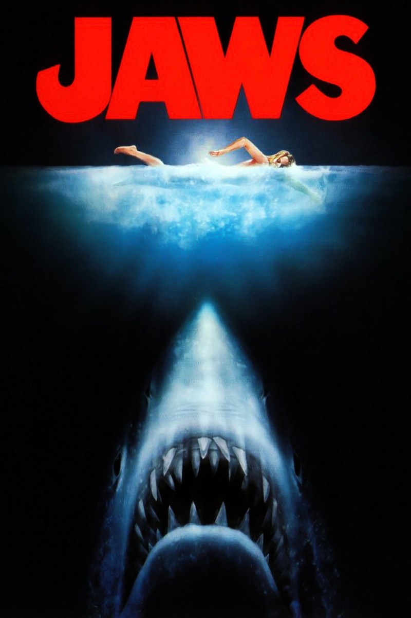
This teaser poster clearly advertises JAWS the movie but without any other information. This shows that this was before the film was released. The shark rising to the female shows the reason behind the name of the film which was that it is going to be based around shark attacks. I dont think this is effective because it doesn't stand out as something that is going to be scary or atmospheric to the audiance it is trying to attract.
To improve the image of the shark being more scary blood or other effects could be used to surround the image, this will make the shark stand out more as opposed to the female.
The reason why this poster isnt effective is because it doesn't hint at human killings, it is just straight to the point. This also doesn't attract audiences because it seems to be the plot has already been revealed without any other plot to merge with it, making this a cliched shark attack film that is watched many times.
The title of the film is bold which is typical in horror films. The red symbolises the blood and gore that is to come. However the composition of the Title at the top isn't very atmospheric and doesn't seem to merge with the scene. Once again it is straight to the point of blood and gore but doesn't show any other plot indications which would make this worthwile to watch. The size of the title is almost thrust into our faces instead of enticing us to come closer to see, therefore it is repelling the audience instead.
The teeth of the shark to me is the only effective part of the poster, as they dont stand out as being thrust into the audiences faces that this is how they are killed. Being illuminated by black is effective because it makes them appear more deadly by not being noticed as much. If the rest of the poster was created this way it would be more effective because it causes us to come closer to see.
